I was gonna post the APOOO Book Club review of All About Marilyn, but I want to wait for that review to be posted on their site. So I'm posting this article about Marilyn's cover art instead.
All About Cover Art
(WARNING! LOTS OF PICS!)
Stop the presses! There’s a Nekkid lady on the cover o’ Shawn’s new book! Cover your eyes! Think of the children! THINK OF THE CHILDREN!
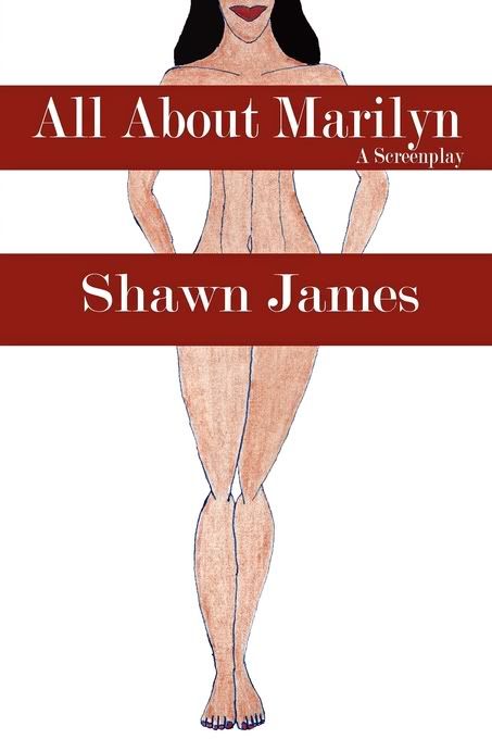
I know that's the reaction of some to the All About Marilyn cover. However, there’s nothing sexual or titillating about the art on this cover. These pictures relate directly to the story in the book.
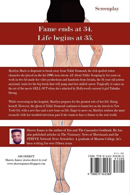
The concept for the All About Marilyn cover is an art nude leaning towards an abstract style. The bright red lips are supposed to draw people towards Marilyn’s face where the story of her picture is told. I deliberately drew both pictures with a minimal lines so readers would only be drawn to those red lips.
I got the inspiration for Marilyn’s cover reading the newspaper back in April 2008. Art photos of Carla Bruni (You'll have to Google Carla's pic cause I'm THINKING OF THE CHILDREN!) were featured in a New York Daily News article. The nude picture was modified with awkward black censor bars over her breasts and her hands which covered her genitals. Those censor bars and the sensationalized copy kept us from seeing the artist’s orignal vision; taking our eyes away from the model’s face, the composition of her body language, and the real story in the picture.
By censoring picture, the photographers’ orignal vision became perverted. The black bars distorted the details in the photograph’s story, forcing the viewer to come up with an incorrect image of what they saw in the facial expression and the composition of her figure. And when it came to Americans, a simple art nude becomes sexualized and with the simple addition of a pair of black bars and a sensational cover story.
Understanding how some Americans sexualize art that features nudity, I decided the censor bars would be an integral part of telling Marilyn’s story. Along with the half-face, they keep the picture of who is Marilyn Marie incomplete. This unfinished image of minimal lines and red censor bars draw the viewer’s eyes to the red lips of her face which tell the story of a strong, confident black woman who is being kept from revealing the truth about herself to everyone.
Developing this concept took multiple drawings and many, many, many tries to get right. Art is a very instinctive process; it has to “feel” right. It took a year to finally created something I felt comfortable presenting. The cover concept for this “Abstract Sista” front and back are a combination of pencil Ink, colored pencil, acrylic paint, a laser printer, and Photoshop.
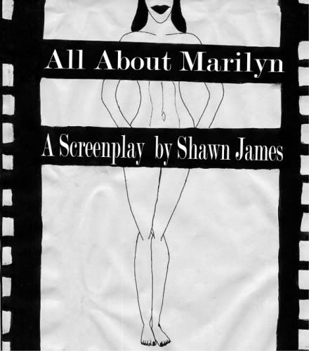
This was the first design I came up with for the All About Marilyn cover. Don’t have a color jpeg, (old computer died) but it was hand-drawn, and handpainted. Featured in the back matter for The Cassandra Cookbook on page 264, I actually considered using this art before all the negative reviews about the cover for The Cassandra Cookbook made me rethink it. Looking at it now, great googly moogly it looks like crap. Her entire body looks like rubber and her right foot looks broken.
Cover concept #2 was still very rough. Sketched up some new art with cleaner lines. I used Microsoft’s ancient Picture it! software to clean up the censor bars and the filmstrip concept. I went for a full abstract concept on this, wanting to focus only on line, composition and form so the reader’s eyes would be drawn only to the red lips on the white page. In this concept, decided to give the back cover the abstract theme, making it All About Marilyn; her story would be between the pages of the book.
This art was to be final, (again) but after the Harlem Book Fair of 2009 I seriously rethought Marilyn’s cover concept. I was really getting heat about my interpretation of Cassandra Lee on the cover of The Cassandra Cookbook and I didn’t want Marilyn’s story dragged down into that light-skinned/dark-skinned nonsense, or worse some people implying that the character on the cover was white. I didn’t want those narrow minds misinterpreting my art and perverting it the way they did the Bruni photo.
Worse, I didn’t want to be branded a sell-out when my intention was to make the cover art about lines, composition, and form. These fundamentals of art are often hard to see when color is added to a drawing; this is why many art photographers prefer to shoot their models in black and white. With those two colors and the shades of gray, we get a better understanding of the story the photographer is trying to tell through the lines of the body and the body language of the model. And to my chagrin, those blasted censor bars didn’t line up front and back.  So it was back to the drawing board. again. This time I was for a looking for a compromise that would allow me to maintain my original concept and satisfy the reader.
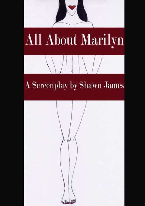
Cover Concept #3 I took this design through five Lulu test copies up to the final finished product. Went with high key style on the abstract art so the colors wouldn't distract from the my original concept.
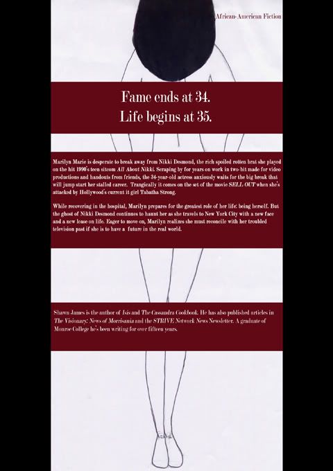
With the help of Adobe Photoshop Elements Software, the red censor bars line up on the front and the back of the cover. From head to toes, Marilyn is the same size front to back. I smoothed out the rough spots in the art (dust, specks, an unevenness of the hair from front to back), and brightened things up (I had a literal headache trying to denote the difference between the CMYK red that prints on POD presses and RGB red that’s on every computer monitor)
I made sure the white letters could be more readable on the back, and I placed the notation “A Screenplay beneath Marilyn’s breast bar because I felt it was more discrete than the awkward placement on the bottom bar with my name in the second concept. Hopefully, the red lips on the face will be the first thing people look at.
